Thursday, 12 December 2019

Chrome/ colour edits


Adding colour 

I was suggested in my crit to explore variations of adding colour, and was also inspired by Eric Hu's designs and their interesting manipulation of colour. These posters use a gradient/ 3D effect, which in turn provided a more dimensional aspect to my design. 


I do really like these colour edits, but my worry is that they don't fit the submission expectations for Oripeau, as their standard is black and white design work. Additionally, it is more cost effective to print large scale in black and white.

Chrome effect (black and white)


I am super happy with the effect and extra drama the chrome effect contributes to my work; I think I prefer the bottom poster design however, as it would work nicer large scale due to the additional halftone. I think tomorrow I will paste the bottom one up actual size. 


Wednesday, 11 December 2019

Making the soap concept physically


Primary photos (very gross)


I decided to make the soap symbol poster physically, as the photoshop edits didn't look as strong as I wanted them to be. I just took some very gross pictures of the soap and then manipulated them in photoshop to add more contrast. 

Edited posters 


I experimented with various compositions and backgrounds; I quite like the first poster design as it has consistency with my other posters in the series. However, in my feedback, it was suggested that I could be braver with composition and just print the bar of soap really small to create drama and more negative space. Due to this, I am going to further develop idea visually, but overall I am happy with the concept itself. 


Tuesday, 10 December 2019

Research into colour for poster design


How can I relate colour to the ideas behind my poster?

After experimenting with different colour paper stocks, I definitely know that I want to print my index poster on coloured paper, and am torn between orange and green as these were the most picked up on in my crit feedback. I decided to justify these design decisions with research into their meaning so I can link my posters back to my overarching themes. 

The meaning of green in India 


I wanted to have a consistent reference to Indian cultures regarding the concept of the moustache, so looked into what green represented in India. Pretty ironically, it represents God, which is perfect for my Index Devil design as they are polar opposites which would add another layer of irony to my design. Due to this, I might paste up my index poster in a green paper stock. 

Further research on military moustaches


Moustaches in the military 

I did a bit more research to inform my icon poster further, as I wanted it to communicate the various popular moustaches around the world in the military. I decided to choose these four as they had the most prominent history, and varied in moustache style. I am going to use this research in my icon poster, as I was suggested to create abstract shapes to represent each moustache. 

India


Nepal


The UK


France


Raf Rennie visual inspiration


Raf Rennie


I was suggested to look at Raf Rennie for his interesting use of shapes to break up images. This design in particular involves text, but what I like about it is the use of shapes that create an almost ripped effect; I could use this effect when I come to pasting up my poster to communicate the idea of razor cuts? I also like how this design uses various textures, which links to my own design work with the inclusion of halftone and grain. 


I really like the clean lines of this design, and their contrast with gradients. This piece has a nice abstracted nature to it, which is referenced in my icon poster design, with the gradients used to represent the idea of hair growth. 

Eric Hu visual inspiration


Eric Hu


I looked at some of Eric Hu's work to find inspiration for contemporary design in my own work. I really like how this piece introduces colour in some abstract shapes; I could use this approach to adding colour in my own work, as I was suggested to experiment with some colour. This could work nicely in my index poster design, as I have a lot of negative space/shapes that could be filled with colour - I could also use a gradient effect similar to this design possibly?


I like how this design in particular uses a juxtaposition between clean, sharp font and blurred shapes, as it creates quite a nice dynamic. This approach also works well in regards to it's way in developing tension and a visual hierarchy, which relates to my methods of my icon poster with blurred paint strokes and their juxtaposition with solid fill. 


I also looked at this poster design as it involves quite an interesting use of colour and gradient work. I think that I want to test adding gradients and colour as it could create a nice contrast between black and white and colour. 

Monday, 9 December 2019

Sketchbook development and crit


Todays' design development 


I was suggested to alter my illustrative poster slightly, by adding more grain to the white and blacks. I like the effect that this gives as prior to this development it looked almost too clean cut, and the grain combats this with more texture. I think that overall I will use this poster for my index concept, and could paste it up tomorrow? I think the grain just makes everything look more consistent and it would be interesting to produce some rips when I paste it up to add some texture. 


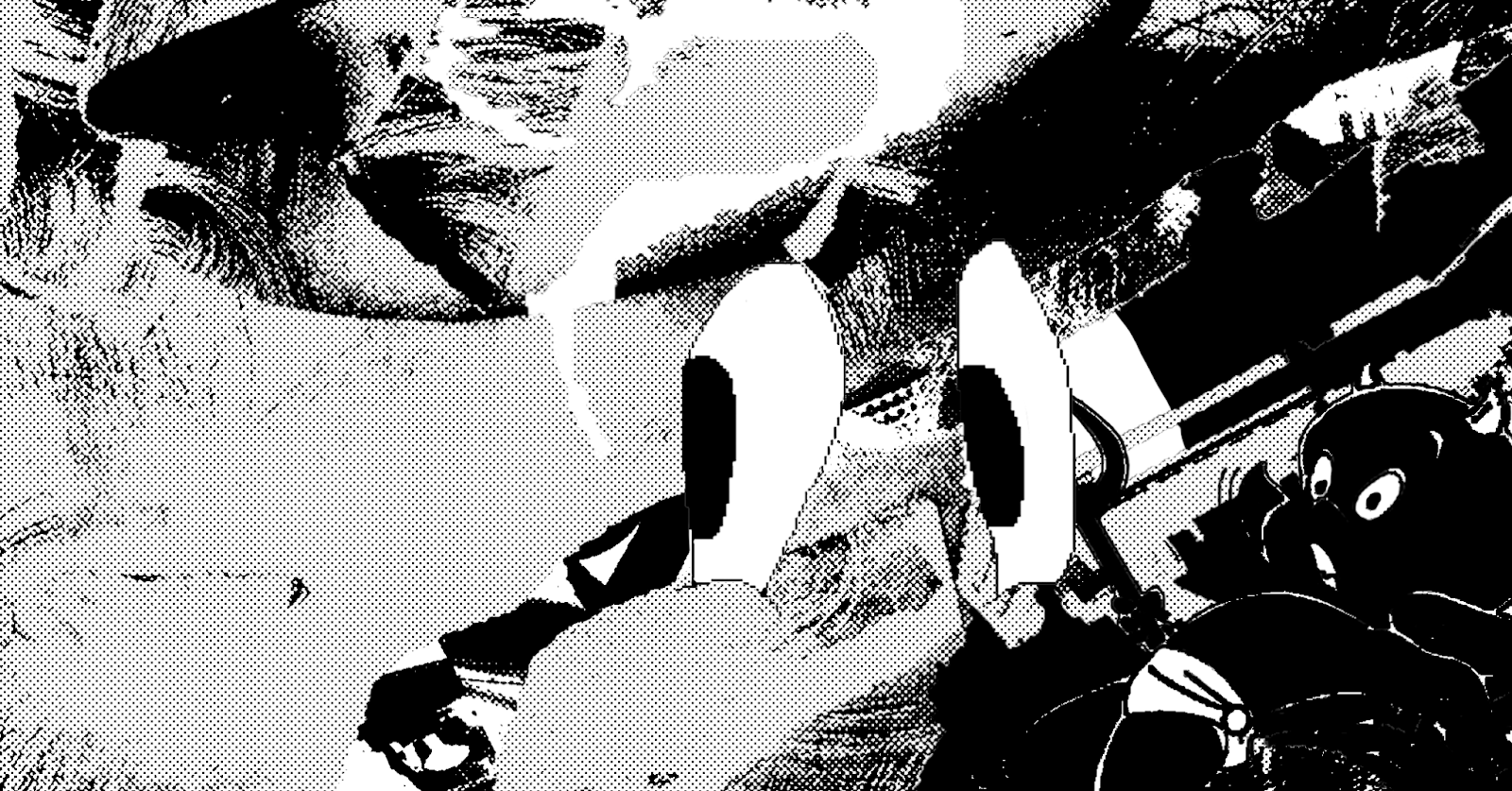
I was then pushed towards simplifying my abstract icon shapes further, by cropping the image to provide more negative space. My feedback was that the shape/gradient worked really well, but I could manipulate the hair shapes to represent different popular moustache styles around the globe. This design features moustaches from India, Nepal, Britain and France. I really like the subtle reference to moustache styles in this. Additionally, alongside me printing some stickers, it would be quite fun to add stickers on this poster in particular to convey a sense of a poster series within my design, as they could all have recurring shapes and images subtly added in (as well as it making my posters interactive). 


The main thing that I've found is that my poster concepts so far lack a lot of photography, and are more collage or illustration based. Due to this I developed the concept of my symbol poster to feature a bar of soap covered in moustache shaped hair; this would relate to the concept of low caste people having the role of cleaners, and their inability to grow moustaches in the Indian caste system. These are some photoshop mock up posters to just test with how I could produce the poster, but I think I am going to take images of the soap in real life. The only doubt I have about that however, is the risk that the hair strands won't strongly communicate the idea of moustaches. However, I could use that to my advantage in the sense that symbols are learnt and not fully obvious.

Crit responses

Overall, my crit feedback was very positive, and was just a case of narrowing down and refining my ideas. Every comment I got actually focused on colour, and liked the idea of me printing on coloured paper stock - particularly orange? Additionally, I was suggested to add colour in certain sections of my designs, so I might do so in order to experiment more. As well as this, I was also suggested to incorporate the idea of razors by ripping up parts of my poster when it's physically pasted up, which I will definitely try.


Friday, 6 December 2019

Abstract Comics research


What are Abstract Comics?


I decided to look at the genre of abstract comics to visually inform my poster design for the 6 degrees of separation project. I found these interesting as they lack any words and like stated above, focus on cutting up patterns which linked to my approach for the collaged material of my 6 designers' work. 

Visual references 


Here are a few examples of these designs that I personally like, as they are very image based with interesting approaches to manipulating visuals; I really like the juxtaposition between the melted effect/warped illusion of the images, alongside the straight cut edges of the comic boxes. In a sense, this was the kind of style I was going for, as I found that a lot of the shapes I took from my 6 designers work were very circular and lacked straight lines. I also find the inclusion of an abstracted barcode quite clever, as it just provides a nice subtle reference to classic comic books; I could try including this in my poster design somehow? Furthermore, the paper stock for these zines is really nice, as it has that nostalgic feel of authentic comic books, again showing a subtle homage to its inspiration. I could try introducing more subtle nods to classic comic books in my own design, as at the moment it lack as a strong association.  

Six degrees of separation - development of initial poster visuals


Forming shapes from visuals 


I decided to start the poster design for my chosen graphic designers by producing some shapes that I traced from small details in their work; above are some shapes taken from Shiego Fukuda and Wes Wilson's work. This allowed me to abstract my visuals from their designs in order to create subtle references to their own work. What I found is that the rounded shapes looked a lot nicer, as they almost merged as one. 

Using shapes with collaged material 


Initially, I visually explored each artist by using these shapes to cut out collaged material in order to capture their work/style. I did this by hand somewhat messily, as I wanted to provide a slightly rough effect which would be difficult to produce digitally. I also did a little experimentation with how the text could work. However, these initial designs weren't made with any idea of composition in mind, which I later developed. In order to test out colour schemes and visuals, I printed on various paper stocks such as neons and gridded paper, as well as inverting the image. I actually really like both the gridded paper and the inverted version, as it looks more visually striking and abstracted from the artists work.

Comic book style 


I was suggested in some feedback to explore the composition/ layout of comic books, as very graphic, almost cartoonish aesthetics were an overarching theme in all of the designers work. I like this idea as it is a nice way to visually show the links as the format of a comic book serves as a timeline for the links between the designers. I decided to use the collages I made previously, but cropped and enlarged to fit each comic strip box; I kind of like the way that some boxes have more negative space than others, and I made the decision to have some boxes larger for designers who stand out in the links. The issue with these initial designs however, is that I feel like they don't scream comic book style, and are slightly too detached from those kind of visuals. I think that I need to try altering the scaling of the images, and maybe introduce more comic book references - like text maybe? Linking to this issue, I was suggested that I could add rectangles in replacement of words to show an abstracted reference to captions in comic books. 


Tuesday, 3 December 2019

Playing with abstracted shapes


Abstract illustrations 

Following the success of today regarding my illustration work, I decided to tackle another element of my crit feedback by creating some abstracted moustaches for the icon poster design. 


I used a mixture of textures and line weights to create some abstracted moustache shapes; I used some blurred shapes for the background to serve as a foundation to emphasise the sharper shapes.


I added some quick textures and duplicated elements of the design. These are still just some initial/rough layouts, but I think it would be interesting to continue an abstract approach, as it would be a unique way to communicate my icon. I also added my symbols of the three heads of Brahma with the three ovals, which provide a subtle nod to my research. I think next I want to further develop these, or possibly even include images? The only issue would be the risk of loosing negative space. 


I decided to further expand on this concept by linking the poster stronger to the idea of an icon; this meant the poster had to show an actual moustache, so I edited the texture/ a zoomed in image in order to convey this. It allowed the poster to have a clearer association with a moustache, which I feel is crucial in an icon design. 


Developed illustration work


Drawing with Microsoft Paint


In order to communicate the playful element of my devil index design, I decided to experiment with drawing on Microsoft Paint, as it had very nostalgic feeling. I am really pleased with how these turned out, as they have quite a witty attitude to them, and carry a nice amount of negative space.

Finalising a sticker design 


I finalised these illustrations into sticker designs (overall producing three different sticker sheets). I thought these would be a really fun way of making my posters interactive, as well as further broadening my playful undertones in my work.

Forming poster designs with illustration


I initially just added/ layered my illustrations with my collages, but felt that it lacked space and looked quite crowded. 


I really like this poster design, as I decided to stick to flat colours with minimal textures; I think it captures the intentions of my index well, as it looks playful yet simultaneously sinister due to the layers and black background. I think that for the index design I'll stick to this approach as I am quite happy with it. I think that these visuals would work nicely as a large scale poster design, as it has a nice balance of negative space and noise, contrasting to my prior designs and the flaws picked up in my crits. Additionally, this poster design would be quite fun to have alongside my stickers, as it could be interactive for audiences to fill that negative space with imagery?


Research proposal presentation

 Research proposal presentation  How does zine culture function as a means to improve the representation of women and make feminist politica...