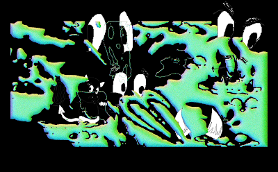
Adding colour
I was suggested in my crit to explore variations of adding colour, and was also inspired by Eric Hu's designs and their interesting manipulation of colour. These posters use a gradient/ 3D effect, which in turn provided a more dimensional aspect to my design.
I do really like these colour edits, but my worry is that they don't fit the submission expectations for Oripeau, as their standard is black and white design work. Additionally, it is more cost effective to print large scale in black and white.
Chrome effect (black and white)
I am super happy with the effect and extra drama the chrome effect contributes to my work; I think I prefer the bottom poster design however, as it would work nicer large scale due to the additional halftone. I think tomorrow I will paste the bottom one up actual size.


No comments:
Post a Comment