Friday, 24 January 2020

Developed poster comic concept


Developed outcome


Here is the final developed digital outcome for the 6 degrees of separation comic poster/ zine design. I think it is effective in the way that it has a subtle reference to the cartoon styles of my chosen artists, yet it still reflects their own work in a collage format. I think I need to now develop this further into a physical outcome; I thought I could create a small zine of these pages with a cover in order to further link to the theme of comic books.   

Thursday, 23 January 2020

Design development on one minute book covers


Further developments 


Because I wasn't very happy with how the initial one minute covers turned out, I decided to play around more with their compositions and tried using other primary images I took. These used the same image, but played around with text positioning and editing. 


This image intended to explore the concept of the universe being created in the time it takes to make a sandwich, as well as the open mouth conveying references to black holes. I think that this concept could be pushed further, and that this design itself lacks a strong composition; also the text lacks any connection to the book itself. Next week I intend to focus on this area as typography is a weak area for me. 


I decided to experiment with halftoning the image and creating a left alignment for the text; I think the text needs to be bigger and should reflect themes of the book itself. Also, I feel like the image is slightly too ambiguous? 


I decided to abstract the image further to play with editing; I think I prefer this edited version as it looks more visually striking composition wise. 

Looking at in-store contemporary book design


Village Books

I decided to look into the context of my book design by carrying out primary research into an independent contemporary publication store - Village Books. This would help me look at the user experience for contemporary audiences, and examples of contemporary book design. 


I noticed that the store featured both flat laid books and some just showed their spines; this made me consider the importance of the spine more, as potentially in context, my book could be displayed with just the spine showing. How can I make the spine of the book cover interesting?


I looked at this book as it used photography in a very simplistic way, and had a very dramatic use of negative space. Although the design decision to simply feature a man on the moon for the cover image, I liked how the image wrapped around the book itself, as it pushed me to question the importance and the role of a consistent design; what is the relationship of the front and the back? 


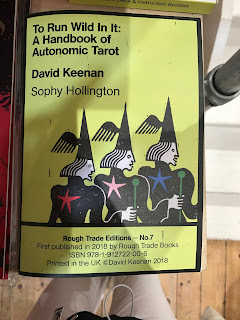
This cover design was interesting in how it combined a traditional handbook aesthetic alongside some playful illustrations that linked to the content of the book; the border was reminiscent of a tarot card.  I found this clever as it combines formality and informality, which would be very appropriate for my own book cover design; what are some juxtapositions I could use to create this ironic contrast? 


Contemporary in-store comic zines


Village Books

I decided to put my comic book zine design into further context by looking at comic zines in person; this would further allow me to gather inspiration from existing work to inform my own final outcome.  These primary images were taken in Village Books, which is a focal point for contemporary publications in Leeds. 


The Happy Sailor by Josh Wayles is a play on the Simpsons and traditional tattoo art, using illustrations to create a hybrid zine of illustrative styles. I really like how the zine explores the Simpsons, and puts a twist on the original cartoon, as it links to my concept of drawing the Garfield minus Garfield comic in a more exclusive style. 


The store had a section dedicated to independent zines, which links back to the idea of the zine revival in my second essay.


This zine played with the Simpsons cartoon style, yet in a plasticine form, which was nice in adding a playful sense of voice; the plasticine in a sense, provided a 3D element to the zine, which made it more immersive. I could possibly try this to create a more immersive user experience in my own design?


I found the process of looking into the atmosphere of a independent publication shop really helpful in allowing me learn the demographics and potential audiences for my comic zine; it is a very niche market, but even the merchandising of Village Books itself was very exclusive and intimate. 

One Minute Sculptures - Erwin Wurm


Erwin Wurm


I decided to look at Erwin Wurms' one minute sculptures, as they inspired the design process for the initial ideas in study task 2 (one minute book covers). The concept behind these images is to create a striking yet absurd composition, that causes the viewer to question the still. In many ways, this links to the idea of 'a smile in the mind', as it pushes the audience to think about the image; these images don't treat the audience like idiots, and this approach could be useful in my own cover design. The photos are nice in how they involve an interesting use of negative space, which adds drama to the composition. It could also be interesting to produce some illustrations from images like these, as it could introduce an element of playfulness linking to the book itself. 

Wednesday, 22 January 2020

Type focused contemporary design


Richard Turley


 "This approval culture, Turley explains, can push designers into a daily existential crisis and periods of self-doubt. “A lot of that bubbled around,” he says. “That and the paradox of a lot of socially-minded left of centre creatives providing the (often rather successful) communications for multi-national corporations whose motives they are entirely at odds with.” 

"Although Turley doesn’t suggest that all of this thinking exists in the design, it was the underlying spirit that drove its direction. He says, “Without sounding too pretentious… the scrawl is trying to find an equivalence for that – the ghost in the corporate marketing machine. Digitized, stupefied. Compliant. Powerless. A bit frantic. With a sense of humour."

I really like this design concept by Richard Turley as it doesn't take itself too seriously, and is playful in the type choices it uses; this use of messy, handwritten type explores the themes of the book in a sense that graphic designers are often in self doubt and take themselves seriously. The type rebels against the formality of design, and the digital world; it provides a sense of human nature and celebrates mistakes. This approach to type and cover design would be very appropriate for my own project, as it would fit the books witty sense of voice; as well as this, the book is intended to be for 'everyone', so an intentionally 'bad' or messy aesthetic could evoke this down to earth atmosphere - it is a science book that doesn't take itself seriously. 

Actual Source - Shoplifters


I found this cover design interesting due to the way that the text is manipulated to fill up the entire page; it makes the title the key focal point and is immersive in how it is positioned to flow onto each line with hyphens. Although this challenges legibility, I think it works nicely in making the text more striking to an audience, which makes it fit into contemporary design. I also like the vivid juxtaposition between the colour palette, and how the yellow doesn't fill the whole page - it almost has a highlighter quality which evokes the idea of a 'homemade' design; it doesn't take itself too seriously. What I can really take from this design for my own inspiration is how it transforms the formality of a sans serif type into something really intriguing and powerful; I could try doing the same with existing typefaces and playing around with compositions etc. 

Symbols in contemporary book design


Questions? (Sereina Rothenberger & David Bennewith)


I looked at this book cover design due to its interesting use of colour and symbol to simplistically communicate the books concept of questions and answers. The 50/50 split of colour is used as a symbol for this relationship between students and teachers, which is cleverly conveyed through the block colours and negative space. I really like the little symbol in the centre of the design, however the only issue regarding my own design is that I would probably need to fill some space with the title and blurb; arguably, I could always make the design decision to have the text really small or vertically like this book cover. 

Kentaro Okawara


I looked at this cover design by Kentaro Okawra, as it was very much focused on block colours and a simplistic symbol design/ illustration. The design itself is very ambiguous, which links to my focus on curiosity; I need to find certain aspects of the book that I can translate into a symbol, as it would allow me to create a clean and simple design, some of which have been chosen for previous winners. 

Faber & Faber


This book cover design collection by Faber & Faber was interesting to me due to its cohesive use of the same colour palette; although the symbols are borderline illustrative, I liked their simplicity and the texture thats used - it almost looks like a quick sketch/ slightly childish. Consequently, I could link this drawing style to the playfulness of Bill Brysons tone of voice, which I think would fit nicely for my cover design and could fit into a contemporary space. I really like the first cover in particular, as it is very abstract and draws the attention of the audience; what shapes could I link to my cover design - circular forms could work in the sense of atoms? 


Illustrative book design


Ines Cox


I wanted to look into illustrative approaches to book cover design, as it would suggest new ways of working and how I could visually communicate my ideas. This first cover by Ines Cox is very minimalistic, yet uses pixelated illustrations and pattern world to bridge a reference to the digital world. The simplistic type at the top of the page allows the design to have a bold use of negative space which creates a sense of drama. 

Arne Bellstorf


In a sense, this comic cover designs themes links to Bill Brysons' non fiction book as it discusses what human existence is and considers somewhat existential subjects; through including illustration, it provides a humanistic quality which arguably further expands on the subject of the comic. It would be interesting to produce some illustrations for the cover design, as I could have more freedom to play with composition and adding a playful characteristic to the book. 


Design strategies


How to use playfulness in design


"There are countless advice-driven think pieces on how to navigate the creative industry and the magic it takes to just think of a half-ingenious creative idea. Some note how a certain schedule can make room for creativity, or a “tidy desk, tidy mind” is the way forward. But for me, a playful approach is one that can enrich any creative project. And playfulness, I should point out, isn’t to be confused with humour or games, though those things can often be more than happily involved.

To me, playfulness, at its purest, is a form of imaginative exploration focused on enhancing how we experience life — our culture, our environments, our relationships, our wellbeing — in ways that are as surprising as they are joyful or rewarding. As we begin a new year in the creative industry, below I break down how the practice of playfulness can be approached, in the hope that it will not only improve the work you make, but also the way it feels to make that work too."

I decided to look at approaches to design in order to suggest a few new ideas in which I could visually explore concepts; this would further expand my ideas, and help me experiment with ways of working. Firstly, I looked at an article on Its Nice That about the importance of playfulness in design; it linked to the themes of curiosity in the book I am designing for, and related to how I want to convey my ideas. Above are a few quotes from the article that explain this playful approach to design, and how it helps graphic designers come up with ideas. I am going to take inspiration from this concept, and try not to hold back in the process of developing designs - the idea of playfulness embraces mistakes, which could end up being the final concept. 

The hilarious art of book design - Chip Kidd


I found this video on book design by Chip Kidd interesting as it discusses some useful aspects of cover design and the responsibilities of graphic designers and their interaction with audiences. Here are the notes I made whilst watching the talk:

  • Designers should question what do the stories look like? How can I visually communicate a story and give it a 'face' and a first impression?
  • A book designer gives form to content, and should balance both
  • Don't treat the audience like a moron 
  • Experiment with redrawing things
  • The book designer has three responsibilities: the audience, the publisher and the reader
  • Make a book look like its lying; lure the audience and make them question the cover
  • A designers role is an interpreter and translator 
  • Play with the spine of books; e.g. the Buddha books spines collectively form an image
  • Deconstruct images to tell a story; e.g. pulling it out of the shelf
  • Book covers should be interactive and immersive 
  • There is a lack of interactivity with e books as it is simply the cover
  • Merge and image with text; a multilayered sleeve approach in the design above (1984)
  • Publishing is a business too; designers must consider both the contemporary audience and the market audience 
  • Show a story!


Generating initial concepts (study task 2)


Primary images

Todays focus was on creating photographs of objects that could capture themes of A short History of Nearly Everything; in our group, we decided to focus on several objects that could serve as metaphors for certain facts or quotes.


Here is one of the contact sheets from our photoshoot; we focused on the idea of a sandwich (the big bang happened in the time it takes to make a sandwich), and bananas (we are genetically close to bananas). The images themselves obviously were not a high standard, but the goal of today was to play with objects and how to communicate visually. 

I actually really liked the receipt concept; it linked to how humans are made, and was witty in the name of the pun 'blackwholefoods'. I think with further development, I could push this concept further and possibly even make my own receipt? Or even a logo for Blackholefoods? 

Testing layout


I really don't like how this design turned out- mainly because of the issue with the image, as I didn't consider what it would look like as a front cover; it would have just been the arm. Also, the composition is just pretty boring, as there really isn't a clear focal point/ hierarchy. Regarding the text, it lacks any excitement and doesn't really bring anything to the design itself.  


The composition for this design is pretty weak as well; on the basis of the front cover, the overlapped images just wouldn't be effective, and are slightly too ambiguous for the book. Also, I don't necessarily get a playful tone from the design, which is what I intended to create. Furthermore, I'm not sure how this composition would involve text, as it would lack a cohesive positioning. 

What to do next/ areas to improve

Since I am not happy at all with the actual designs from today, I need to highlight areas for me to focus on in order to push my design development. 

  • Try typesetting and experimenting with the positioning of type
  • Crop some of the images today?
  • Create illustrations from these images; it could help make the design be more playful and have a stronger link to the tone of Bill Bryson 
  • Look at more contemporary book design 
  • Experiment with ways of creating an image - improve compositions 
  • Look at more niche quotes or facts I could translate 

Monday, 20 January 2020

Interesting book cover design / contemporary design


Visual research

I decided to look at interesting ways other book covers communicate themes and ideas, as well as different practical ways of doing so; I need my initial ideas to be varied and in depth in regards to experimentation. 


I looked at this design in particular for reference of illustrative book covers; the cover features quite a clever metaphor relating to the subject of the book, which allows the design to not be point blank obvious. For what seems to be quite a formal book by the title, the illustration juxtaposes it and offers an intriguing and playful element. I could take inspiration from this method and create some illustrations that would share Bill Brysons' tone of voice. 


I really like the use of photography in his cover design, as the high contrast image treatment adds drama and suspense which relates to the books' narrative. The vivid green colours seem to work really well at creating a striking image, as well as the drama provided by negative space surrounding the image. What seems common with penguins' book covers is that the text/ title is often placed above the image at the top of the book; could this be a convention I follow or stray away from? 


This cover design is interesting in how it uses a very simple shape to develop a symbol, which in itself is immersive to the audience, hence linking to the book itself; I like how it almost creates an optical illusion, and the choice of title placement is very original. I could possibly play with a similar concept in regards to the subject of the non fiction book; e.g. black holes?


This very simple cover design by David Pearson for Nineteen eighty-four embodies the idea of 'a smile in the mind', through the clever method of covering the books title to attribute to the themes of censorship within the book itself. I think that often in book cover design, simple strategies such as this work really effectively as they lack obviousness and maintain originality. It would be interesting to play with how I could subtly manipulate things to send a message, as it would make my design more intriguing.  


These cover designs involve methods using exclusively simple symbols and shapes to convey messages; they take inspiration from op art, which adds a layer of illusion to the covers. These symbols are visually striking, and are clever in the sense that they don't directly relate to the book titles themselves. There is a hypnotic element to the designs, which in a sense leads intrigue to audiences. I could play with this method in building curiosity to my audience, as the book itself was written on the basis of curiosity. 


This cover design for Truman Captoes' In Cold Blood uses a focus on type design inspired by newspapers to convey themes of the books crime narrative; the ripped effect is quite clever in creating a 3D image, which provides depth to the design instead of it looking quite flat. Akin to previous contemporary design, this cover isn't an obvious reference, and pushes consumers to consider the designs relevance. The negative space surrounding the image also works in favour to add drama, and create a focus on the paper. It could be interesting to use a ripped effect to create texture in my own design? Or even focus on one simple object. 


This cover for The Werewolf of Paris works nicely in how it uses negative space to create a very dramatic and suspenseful image, linking to the themes of the novel; the high contrast between the black and white tones provide a focal point of the teeth. I also like how the image treatment of the teeth works to create a more abstracted image, with a clear focal point. I could take inspiration from this strategy to create drama in my own design - however, I'm not sure how this would work in relation to the witty themes of Bill Brysons writing.  

Erik Carter


I decided to look at Erik Carter in particular as he is known for his simplistic and abstracted book cover designs. I really like the abstracted shapes used in the first cover, as it creates a high contrast image that slightly disrupts the title; due to this, there isn't a feeling that the type is just placed on top of the image, as it feels intertwined with the image itself. As well as this, the involvement of shapes links to the book itself, yet obviously in a very abstracted way. The design for 'the weight of things' is solely focused on type, yet uses it to create an overarching theme relating to the book; the text creates a sense of heaviness, and I like how each word interacts with each other. In my design development, I could push myself to solely use type to create a personality; e.g. how could I use type to create a link to science? The last book cover was really interesting to me, mainly due to its juxtaposition between the text and the illustration; the topic is about 'anything sad' yet is coloured playfully and quite childishly, which is further explored through the illustration. This links to my own design decisions as I want to create a sense of playfulness; I could do so by creating 'bad' drawings to add a sense of humour?


Research proposal presentation

 Research proposal presentation  How does zine culture function as a means to improve the representation of women and make feminist politica...