Village Books
I decided to look into the context of my book design by carrying out primary research into an independent contemporary publication store - Village Books. This would help me look at the user experience for contemporary audiences, and examples of contemporary book design.
I noticed that the store featured both flat laid books and some just showed their spines; this made me consider the importance of the spine more, as potentially in context, my book could be displayed with just the spine showing. How can I make the spine of the book cover interesting?
I looked at this book as it used photography in a very simplistic way, and had a very dramatic use of negative space. Although the design decision to simply feature a man on the moon for the cover image, I liked how the image wrapped around the book itself, as it pushed me to question the importance and the role of a consistent design; what is the relationship of the front and the back?
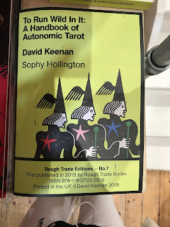
This cover design was interesting in how it combined a traditional handbook aesthetic alongside some playful illustrations that linked to the content of the book; the border was reminiscent of a tarot card. I found this clever as it combines formality and informality, which would be very appropriate for my own book cover design; what are some juxtapositions I could use to create this ironic contrast?


No comments:
Post a Comment