Wednesday, 15 September 2021

Design Practice and Theory 3 (initial research proposal)

 Design Practice and Theory 3 (initial research proposal)

Research question

Zines and diversity; how does zine culture function as a means to improve the representation of marginalised groups?


Or the representation of women/ feminism 


Background/ contexts 

Zine culture has always provided a sense of community within marginalised groups, as its’ niche and handmade nature allows the zine format to propagate in intimate and personal settings. Zines serve as a way to represent the individual; inherently non conformist in many ways, zines break against the status quo and exist to provide platforms for unheard voices. 


Outline of the brief 

Create a zine/ series of zines that represent a marginalised group. Blending elements of digital media alongside a zine could also be relevant in providing longevity to printed matter and appealing to the intended audiences. 


Mandatory requirements 

The outcome has to be printed physically to relate to the traditional DIY elements of zine culture. 


Research aim

To explore how zines are still relevant in representing marginalised groups, in both a printed and digital format; integrating traditional zine design principles with contemporary digital design to argue for the longevity of print existing in a digital environment. 


Rationale

I want to research the topic of zine culture, as it is something that is rich in history within graphic design; I’m interested in how such niche publications with small print runs can make differences in the way marginalised groups are represented and accepted within society. In terms of my own practices, I find zines a perfect way to create a snapshot into different cultures. The DIY nature of zine culture also intrigues me as it is a practice that is incredibly playful/ personal; this is relevant now more than ever, as a sense of intimacy in design is arguably lost through the rise of digital media. I want to investigate this conflict, and delve into whether zine culture can evolve and present a continuation of personal design online. 


Contexts 

Zine culture is rich in both cultural and sociopolitical contexts; there are also many aesthetical contexts surrounding zine design also, which ties into the expression of the human condition. 


Theoretical approach

I want to look at theories behind marginalisation, the human ego, and individuality, as they tie into why zines exist and what they aim to represent. It could also be interesting to assess the concept of commodification in the context of zine culture, as recently there is a surplus of zine design through their commodication and aesthetical appropriation (Marxism); looking at how zines rebel against aspects of mass communication as a result of capitalism. Also, theories behind subculture will be applicable to zine culture, as it investigates the element of how marginalised groups may become trend based or more culturally accepted.  


Methods

I also want to look at the semiotics behind the aesthetics of zines, and the visual languages used within them. It could be interesting to carry out some primary research by interviewing designers behind zines, and to get their thoughts on representation. As well as this, it could be fun to put theory into practice by running a quick zine workshop.


Practical outcome

I want to produce a zine that represents a marginalised group. To investigate the relevance of printed matter, I also want to integrate some elements of digital media in order to explore whether zine culture can function online. 


Summer reading list 

Cultural theory and popular culture by John Storey 


Postmodernism or, the cultural logic of late capitalism by Frederic Jameson 


Representing women by Myra Macdonald 


Gender and the media by Roaslind Gill


Inside subculture by David Muggleton


Notes from underground: zines and the politics of alternative culture by Stephen Duncombe


Behind the zines: self publishing culture by Adeline Mollard


DIY by Amy Spencer


Girl Zines : making media, doing feminism by Alison Piepmeier  


Design(hers) by Viction:ary


Fanzines by Teal Triggs 


Girls Make Media by Mary Celeste Kearney 


Future Girl by Anita Harris


Not My Mother’s Sister by Astrid Henry


Documentaries 


Dirty Girls (1996)


Time management 


Statement of intent

601 dissertation briefing (initial notes)


601 dissertation briefing (initial notes)

  • Focus on publications 
  • Find an issue within this subject to write a question about 
  • Stylistic choices? 
  • Publications are inherently middle class; solving this issue. Marxist theory 
  • Zine culture? Punk culture and subcultures; the exclusivity of zines 
  • Are zines still a personal format; ego and the human condition 
  • Is the commodification of graphic design causing the industry to become too trend based? Capitalism and Marxism 
  • Gatekeeping in graphic design? 
  • Zine culture and the human condition/ ego; do zines function as a way of representation/ breaking down the status quo 
  • Illustration? Is illustration being commodified through corporate design? E.g Facebook illustration 
  • Is design in activism becoming too aesthetically pleasing? Is activist design on social media too trendy? 
  • Zines and third wave feminism; exploring identity and rebellion 
  • Can zines serve as a means to improve representation and acceptance of minority groups? Zines and diversity 
  • Zine culture and diversification
  • Do film posters still matter?

Thursday, 6 May 2021

End of module evaluation

 End of module evaluation

Overall, I feel like my final outcome for the 505 brief definitely pushed my confidence in setting my own briefs and challenged me to design in order to resolve issues; this is something I have touched upon in other modules, but because the nature of this brief was surrounding specific issues I feel like I took this into consideration a lot more. I feel like my strengths in this module were focusing more on conceptually driven work, as the techno tourist guide was heavily influenced by research and context. I'm pretty happy with how the final outcome turned out, as it feels a lot more refined than previous projects due to this conceptual nature; I feel like I was way more successful in justifying my design decisions because everything was more reinforced by my research. In light of this, I found it really fun to apply concepts to things I might have previously overlooked, such as the format of my publication and its interactive user experience; I feel like the outcome considered audience participation and user experience more because of this, as well as the fact that I was designing to quite a niche audience. 

In terms of my own ambitions as a designer, this project definitely took a direction of the kind of work I want to produce, as it challenged me to think a lot more about range and distribution and how I could design across multiple platforms. As well as this, the actual issue I selected for the brief was something I was interested in, so I feel like the outcome aligns with my own personal interests; this is mainly the case in the context of designing within the music industry, but I found it quite fun to play around with themes of censorship as it pushed me to think more outside of the box. 

My weaknesses within this module were probably the fact that I feel like I could have taken more risks; because my designs followed strict rules and had the same visual language, I feel like I kind of limited myself and could have maybe experimented a bit more. This is especially the case with the QR code side of my outcome, as I feel like I could have delved more into user interface design, or possibly motion graphics? Despite this, I'm still happy with my outcome, but I think I could have been more confident in trying new things instead of sticking to what I was comfortable with. I also feel like I could have produced my work or experimented more with creating physical outcomes, but obviously I was limited because the logistics of my outcome were pretty complex; it would have been nice to finish 2nd year with a physical publication, or just something to show physically for the project. 

In regards to time management, I feel like even though I have an extension and all things considered, I've managed to keep motivated and complete the final outcome pretty fast. I definitely feel like I organised my time pretty well, as I have finished the project only a couple of days after the original submission. However, due to having an extension I feel like I could have given myself more time to take breaks from my work, as this has definitely impacted my confidence in the final outcome. For example, I was working a lot on this project over easter when in retrospect I feel like I could have given myself more of a break for my wellbeing, etc. This is something I want to have more of a balance of in next year, as although I have produced my outcome on time, I want to give myself more time to take a break in order to help me stay motivated and confident with my work. 

Friday, 30 April 2021

Print specification

 Print specification 

5X CD disc publications

4.7 inch diameter. Digital print using speciality neon inks. Coated paper. 350 gsm.


CD case 

Custom made. 5.59 X 4.92 inch. 1.95 inch deep.Clear plastic.


Outer and inner CD covers

Digital print using speciality neon inks. Coated paper. 175 gsm. QR code linking to google maps. 


Stickers 

Neon gloss vinyl. 2 inch diameter. 


5X poster series

A2. Digital print using speciality neon inks. Coated paper. QR code link to digital poster.


Wednesday, 28 April 2021

Phone mockups/ gifs

 Phone poster mockup gif frames

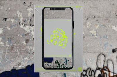
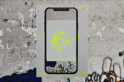
In order to further explore how the QR code elements of the project function, I wanted to create some more mockups to navigate how the interactive user experience works when the audience scans the posters/ maps on their phone. I wanted to keep the designs minimal to avoid over complicating the visual language, as well as linking to the themes of censorship within the project. As well as this, the user experience is pretty self explanatory to the audience, as they will have the pre existing knowledge to scan the QR codes as the posters are part of a scavenger hunt. 


To bring the posters to life and to showcase how they function, I created these mockups of the posters in urban spaces being scanned. This further contextualises the posters in an urban setting within Berlin, which is why I chose the feature the backgrounds in these mockups. To reiterate, the user experience of the poster scavenger hunt involves the primary techno tourist audience (who have read the publication prior) to locate the maps via the maps provided in the publication, then they scan the posters in person to reveal the symbols and to translate the language from German to English. I think these mockups work a lot better as they provide the context of the digital and physical elements of the project, which was essential as obviously I couldn't make the final outcome in person. 

Map phone mockups


I also created these phone mockups showing how the maps will function once scanned from the publication. I created a digital map on google maps so the user can have an easier user experience. There is also an element of secrecy to this process as the google maps I created for it is private, so only the techno tourist audience who purchase the publication will have access to the maps. In order to make the maps clearer to the user, the locations pinned on the maps have each assigned colour scheme that corresponds to each of the 5 rules and symbols. 


Tuesday, 27 April 2021

Sticker sheet development

 Sticker sheet development 

I thought it would be appropriate for the range and distribution to include stickers within the publication, as it ties into the anti phone policies of Berlin's nightlife; many clubs putting stickers over visitors phone cameras. I wanted to keep the stickers simple and relevant to the rest of the project, so I thought it would be fitting to use the symbol motifs and their assigned colour schemes. This allowed the project to be more consistent, and further exploring tangible elements that the techno tourist audience can play with and interact with. 


In terms of the physical elements of the stickers, I am undecided whether to have them loose in the CD case/ publication, or printed as a sticker sheet as a sticker sheet could be a way of adding some information/ context to the audience in terms of what to do with the stickers. I'm not sure where I would put the sticker sheet either; it could possibly slot into the back of the CD case, or I was thinking that the symbol shapes on the actual map inside the publication could be printed and peeled off as stickers? 


The main limitation of having the map symbols peel off as stickers is that they are quite small in order to be precise to the locations of the map. Upon reflection, I think having the stickers loose in the CD case would be more appropriate, as it wouldn't distract from the core elements of the publication, and would link better to the themes of censorship as the audience won't be explicitly informed on the use of the stickers - instead they have to figure that out themselves. 


Final poster outcomes

 Final poster outcomes

In the studio today I asked for some final feedback on the posters to decide which versions to use for my final outcome. Personally I really like the designs with the grey background over the ones with the circular contrast to the background, as I feel like visually it fits better with the publication design and plays with negative space in a more interesting way. My only worry with this was that maybe the QR code interaction where the audience has the twist the symbols might not have been as clear as there wouldn't be a distinction between the disks and the rest of the poster. However, after discussing this in the studio, I realised that the audience will already have the pre existing knowledge to twist the posters digitally, as the same rule was applied to the publication; this also makes the poster scavenger hunt a bit more playful and 'secret', as the only people that know how to reveal the symbols will be the primary audience of the techno tourists that have read the publication prior to visiting Berlin. This element of it being a secret also is more relevant to the themes of censorship I have focused on throughout the project, so keeping it less explicit is maybe a better idea. 


These are the final concepts for the poster designs; I have included the translated versions with the symbols intact and the initial German versions that have the twisted symbols; the twisted versions will be the ones physically printed, again to relate to themes of censorship and to encourage audience engagement. 

Mockups


Although I won't be printing the final outcome physically, I still needed to test out how they would look printed out, and how added elements of texture would function. I created the above mockups to replicate what the posters would look like in the public spaces in Berlin. Based off my research into my print specification and printing methods, I learnt that the vibrance and neon colours of the design might be slightly affected, so these mockups kind of showcase that by being slightly less saturated than the digital versions. Despite this, I still feel like they are appropriate and link to the rest of the projects visual language, and if anything the added texture creates more of an urban and gritty feel that aligns with the settings that the posters will be located in. 


Printing considerations

 Printing considerations

After discussing my ideas in the studio, I was suggested to look into the print specifications of my designs. Because I am printing in neon ink (RGB), I need to research into what methods would be best for the printing of my posters and publication. 

Screen printing would probably be best for the poster designs, as the base layer will be a grey colour and in order to allow the neon colours to stand out, it would be best for the neon elements to be blocked out and printed on a separate layer.

Digital printing could also work for the project, as I could look into printers that are able to print in the neon colours that I need for the designs. I think there are a few printers available that can offer a neon ink printing service, and this method would work better for the publication in particular as obviously the text is quite small so screen printing wouldn't be suitable. 


From researching into printing in neon, it looks as though the ink I would be using for the posters and publication will be a special pre mixed printer. Ideally I would want to print digitally, so the ink side of the print specification is something that would have to be specially mixed. 


I found a printing service that specialises in neon inks, which would be appropriate for my designs in order to maintain the vibrant colour scheme I want. In terms of paper stock, they advice that silk/ coated paper is best for neon inks, as it is less absorbent and keeps in the saturation of the colour. 

In order to showcase how the posters will look physically, I need to create some mockups to see how the colours would look on this paper stock. 

Monday, 26 April 2021

Publication mockups

 Publication mockups

One of the main priorities for this week is to translate my designs into mockups in order to test them out and see if they work in the context of the CD packaging. This was also essential as I need to somehow showcase how my publication will function as I am unable to produce it physically. 


I found a decent CD case mockup online that was perfect as it was clear; I didn't want the actual case to distract from the cover designs, so this was important to the practicality of the publication. I'm kind of torn between these two versions, as I feel like the second symbol version looks more balanced and links to my type more? I might ask for some final feedback on this in order to refine my decision. 


I'm torn between these two versions, as one includes the 'guide to techno tourism' on the spine and the other is without. I'm not sure if this element of the design is that important as it kind of takes away from the theme of censorship; by keeping the design minimal with the symbol collage, it ties in better to my aims of keeping the publication censored and initially intriguing to the audience. I might ask for some peer feedback on this, as obviously its quite a small detail/ issue that I just need to decide on. 


I also created a mockup for the inner cover design; overall this works pretty well, as the main component of the inner casing is the publication anyway. I decided to use the new typeface version as peer feedback suggested it was most effective as it allowed the concept to be consistent with the typeface used for the publication. Also, I feel like the border on the type helps make the visual language stand out, placing more emphasis on the type/ title. 


I also needed to put the publication into the CD case, so did a mockup for each separate rule; in practical context, these will be layered on top of one another. I also included tow versions to show how the publication functions and interacts with the audience; some show the twisted versions that will be how the publication will be packaged, and then the other versions show how the publication will look once the audience twist the correct disks together. I think to further showcase how the publication functions in terms of the user experience, I need to create some gifs of the publication being twisted. 


This week's checklist

 This week's checklist

  • Have a crit on the posters to decide which ones to use for the final outcome
  • Create mock-ups of the final publication; either scan in a CD case or find an online mock-up
  • Create poster mock-ups
  • Create short gifs demonstrating how the posters and publication are interacted with (twisting)

How does this module align with my aims/ aspirations as a designer?

 How does this module align with my aims/ aspirations as a designer?

I wanted to reflect on how the 505 project relates to what kind of work I want to create as a designer, as especially at this point in the course, I want to be producing work that I would be interested in in the future. In terms of the context of the techno tourist publication, it definitely aligns with my ambitions to go into publication design, particularly in terms of having a niche audience sold in independent book stores; at this point in my progression as a designer, I feel as though I want to head in the direction of designing for smaller audiences, as I feel like there is a nicer sense of community. This aspect of community also is integrated into the techno tourist publication, as it looks at the niche underground scene of Berlin techno and is targeted at a relatively niche audience. 

The project also ties into my interests of the music industry and designing for music, which has helped me consider developing my style to adapt in order to create an appropriate sense of voice; this project has definitely pushed me to consider the tone of the design, and I feel like the visual language has a good balance between my own stylistic input as well as being appropriate for the techno scene. 

Overall, I think the general tone of voice and elements of playfulness that are created by my projects range and distribution relates to the kind of work I want to be producing; although visually linking to my style, the conceptual approach of creating an interactive user experience is something I'm really interested in as it considers how design can function in public spaces and with audiences. 

Research proposal presentation

 Research proposal presentation  How does zine culture function as a means to improve the representation of women and make feminist politica...