Mockup developments
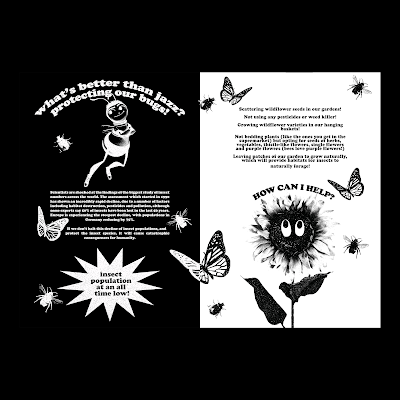
In order to get a better feel of the books' tone so far, I made some quick mockups to better visualise the relationship between the text, image, and bumper sticker tip-ins. I'm still continuing to stick with the ring binding method for the book, as I feel like it will contribute to a more playful and scrapbook-like atmosphere, thus relating to the idea of collecting stickers.
Overall, I think the key elements that work in this approach so far is the more minimal style of the books' layout itself; I feel like it creates a better visual hierarchy and places emphasis on key features within the publication. However, I feel like this could be pushed even further, as the text and image don't work that well together, as having them on the same page creates a bit of a flat dynamic to the publication. Due to this, I think I want to try out designing tip-ins for the text alone; this could even allow me to use a different paper stock for the tip-ins such as seeded paper?
I think now that I have established the content for the book, I need to focus more on the physicalities of the publication in a way that explores improving the visual hierarchy of the book, and considers how the audience will interact with the content. I also need to refine my ideas in regards to the paper stocks used for the publication - e.g. do I want to use seeded paper for the tip-ins?


No comments:
Post a Comment