Animating Alexis' answers for the creative report
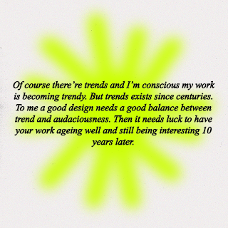
Now that I have received the answers from Alexis, I wanted to finish the interview video by animating his responses. Because his answers were pretty long, I think it would work best if the animations behind the frames were fairly simple so they don't distract from the actual text. Due to this, I decided to stick to a blurred effect with somewhat abstract shapes; this still links to his style, as a lot of his work deals with simple shapes and fluid blurred motions.
Answer 1
In order to make sure that the animation is consistent, I used the same colours from the question animations. I think these colours work nicely (especially when blurred) as they don't massively overwhelm the text. As well as this, the shapes I used are very orientated around flowers, which is another theme within Alexis' work.
Answer 2
Answer 3
Answer 4
Answer 5
Answer 6
What worked best with these animations is that, shown in the above frames, the animations are simple looped videos, which helped me work to a time frame that suited each answer. This was mainly in response to that obviously the time needed to be long enough to read the responses; saying this, I am also going to be making a publication version of the creative report to go alongside the interview animation, so it isn't exactly crucial that you can read the responses super clearly. I suppose the animations work as a complimentary visual representation of Alexis' style and allowed me to experiment more and work on my skills with moving image.
Answer 7
Answer 9
Final title
I wanted to include a credit end title as the animation needed to be rounded off; I used the same animation loop of the theatre curtains from one of the questions, so it worked nicely in tying everything together and providing consistency.
I also decided to add in some music to compliment the visuals of the animation. I ended up choosing 'At The Sunny Side Of The Street' by Jimmy Smith, as it was a nice soft jazz instrumental that fit with the lighthearted and playful imagery. I ended up showing some peers the final outcome, and they agreed that it fit with the visual language of the video, and gave the animation a 'cute' atmosphere. I suppose this aligns with Alexis' style, as he does feature very nostalgic elements that are somewhat reminiscent of childhood which definitely works with the bright colour palette I used.
I think that overall, the animation works pretty well in creating a fun and playful response the the creative report, as it relates to both Alexis' style as a designer and my motives and aspirations of being better at moving image design. This fits well into the goal of the creative report, as I feel like I have improved a lot at working with animation and it has definitely pushed me out of my comfort zone.
The objective at this stage in the project is to now translate this animation into a 'printed' publication. I think to keep everything consistent, I will stick to the same colour palette and typeface so that all of the visual language of the creative report is nicely tied together. I think what might be interesting for this element of the design will be how I could possibly integrate animated elements into the publication design; for example, I thought it could be interesting to create some sort of flip book effect, or maybe include a QR code to the animated interview.


No comments:
Post a Comment