Creating initial symbols
To correspond with the publication and poster series concept, I wanted to develop some initial symbols ideas inspired by the symbols of Kraftwerk's Autobahn. This will allow me to create a visual language that represents each rule for techno tourists, helping me to tie together the publication with the poster series.
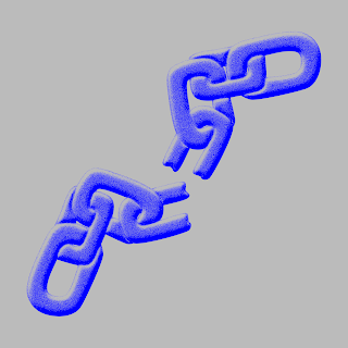
The first techno tourist rule I wanted to create a symbol for was to 'lose yourself'; this mainly refers to the element of freedom within Berlin's techno scene, as well as the architecture of buildings such as Berghain not having any dead ends. After some initial research into what could symbolise freedom, I decided to use a broken chain; this also fitted in with the industrial tone of voice that is at the foundations of Berlin techno, so the broken chain symbol kind of has a double meaning.
In the context of symbols, I wanted to keep the illustration quite simple and clean, so I decided do create a vector based drawing in illustrator. I think this kind of style has the right tone of voice, as it needs to be easily recognisable for techno tourists to understand its connotations after reading the publication.
In regards to further iterations, I decided to play around with adding texture and a 3D effect. I feel like this kind of distracts from the simplicity of the design and overcomplicates it, especially as previously mentioned it needs to be clear. As well as this, I asked a few peers for some feedback and they all preferred the initial vector based symbol, so I think I'll stick with that style.
Creating symbol posters
I wanted to juxtapose the clean symbol by experimenting with putting it into the context of a poster, as obviously the symbols will be featured as part of the poster series. I wanted to use a textured background to experiment with creating more of an abstract tone fo voice, as I want the posters to still have themes/ undertones of censorship. For this outcome in particular, I felt like it was missing something in the top corner, as the chain looked kind of washed out. The images I used to create the textured background were all from Tilman Brembs photo series that captured the techno scene in the early to late 90s, which helped tie the design into the origins of techno, thus subliminally educating the audience.
I decided to add another image to improve the composition, but to maintain a sense of censorship, I inverted it and kept it the same colour palette as the rest of the poster to make it slightly hidden. In regards to the colour scheme used for these outcomes, I really like the combination of grey and bright colours, as it has an almost industrial feel whilst capturing the playful side of the techno scene; I also like how they're kind of difficult to look at, especially with the neon colours, which links to the idea of the posters standing out in the context of public spaces.
Theoretically, this poster in particular would be located in the area surrounding Berghain, as it takes inspiration from the Berghain ethos and architecture. Due to this, I want each poster to include the coordinates of each corresponding location. Obviously I'm at a point where I can develop the typesetting and composition of the posters, but for this initial idea I decided to place it in the bottom corner alongside a smaller version of the vector symbol.


No comments:
Post a Comment