Modular type - using objects

The Brief
Work in pairs to create a typeface using three shapes from existing objects, which captures the word 'functional'.
Initial Ideas
We initially placed our objects in positions to represent each letter of the alphabet. The placement created a focus on 'functionality' by involving shapes of the objects that looked quite mechanical. This made the typeface/silhouette look somewhat strong and solid, which further contributed to the aspect of 'functionality'.
Initial Designs
Following our placement of objects, I began to interpret/trace the images digitally. I decided to do so in block black shapes to add to the strong themes of the type; this caused the type to have a slightly powerful appearance. The typeface additionally featured quite angular serifs which contributed to this aspect of strength.
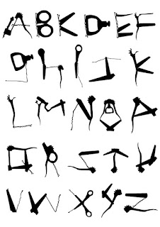

Final Development
For the final development of the typeface, I was given feedback to simplify the lineweight; I think that this approach was effective, as it allowed for more detail of the font, however I feel that it might stray away from the idea of my type being strong and solid. In addition to this, through designing my alphabet, I realised that I could compose the glyphs to give the impression of a tool box in order to convey the sense of functionality.Evaluation
Overall, I am quite pleased with how I interpreted the word 'functional' for my modular type; it does convey a certain practicality by using mechanical aspects such as the cog feature. Furthermore, I also think that the tool box approach fits well with my theme, as it adds a kind of playful touch. Regarding improvements, I'd like to produce a physical outcome to make the typeface more interactive to audiences; for instance I researched into meccano toys which played into the buildable and functional themes, or even turning my type into a kind of Swiss army knife.


No comments:
Post a Comment