Disposables
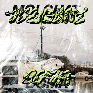
I took these photos on a disposable camera ages ago, but eventually managed to get them developed in lockdown. Above are a select few of my favourites; I really like the colour hue in the photos, as it has a nostalgic feel to it, and kind of looks very Russian/ Soviet with the pale tones? I want to play around with how I could use these photos to combine them with my typography.
Distorting the new typeface
I wanted to slightly distort and play around with adding textures to my typeface; I like how this looks more gritty and has added depth; I feel like it will compliment the photos due to its harshness.
Playing with type/image/ adding textures
I think having the photos in their raw from doesnt really work as it looks somewhat flat; I want the outcome to be a lot more chaotic and play with my idea of censorship. This could involve adding layers to block out the images?
This uses more of a cropped effect and I think this image in particular works really well with the genre; the photo was taken in Snaith after the floods, so most of the buildings had been evacuated, thus linking to the translation of Molchat Doma to 'houses are silent'.
I tried playing with adding another layer of type to play with the idea of censorship; I used Helvetica which is a very formal typeface which is juxtaposed with the bespoke typeface. I feel like conceptually this works, but I feel like using Helvetica doesn't suit the chaotic tone I want to provide. I also don't really like the negative space/ border in this outcome, as it takes away from the chaos and looks very formal.
These outcomes play around with the concept of censorship more, through adding a whitewash texture. As well as this, the whitewash layer links to the meaning of Molchat Domas' name, which makes these versions more conceptually stronger. However, I think that the image still looks a bit too raw; I think it could be manipulated further to develop a less clean and more chaotic outcome.


No comments:
Post a Comment