CD cover concepts
The first design I wanted to explore was ways of how I could censor the symbolism. I tried wrapping the 52 13 symbol around the CD case, but decided that it felt a bit flat and possibly a bit too censored in terms of gaining an audience. I want the 52 13 symbol to be at the centre of the designs visual hierarchy, so thought it would be better to keep it in focus and maybe emphasised with more negative space. However, I do like the introduction of the colour gradient in the spine of the design, as it ties in with the 5 rules and symbols, thus maintaining a consistent tone.
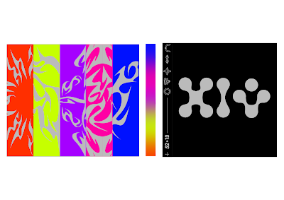
To keep an abstract sense of voice while continuing the visually reference the 5 rules within the publication, I decided to include the symbols on the back of the CD cover, but censor them through cutting them up. I really like how this turned out, as it created quite a nice pattern, while continuing to relate to the contents of the CD case. I also like the contrast between the black backgrounds and the coloured spine, as it places more emphasis on the spine thus highlighting the relevance of each rule.
In order to further experiment with colour, I wanted to try having the background of the CD case in the coordinated colours for each symbol. I don't really like how this turned out, as it feels a bit too in your face and overwhelming, especially with the gradient spine as well.
These two versions include the colour in more of a palatable way; they definitely have an interesting playful sense of voice, but again I feel like they distract from the 52 13 symbol which I want to keep as the centre point of the designs visual hierarchy.
In contrast, I also tried some designs that don't include any colour at all. I actually think these work pretty well, as the design remains minimal and ambiguous. I think that the colour scheme could possibly be added by further design elements such as stickers; this could work well in censoring components of the design?
I also really like these two versions, as they feature a tiny bit of colour just to maintain consistency and add a bit of playfulness to the design. I want to get some peer feedback on which of these outcomes work best in order to decide what direction to go in.
Inner cover
I wanted the inner cover to have the same visual language and tone as the front cover, so decided to keep the same colour palette and feature elements such as the symbol and colour gradient motif. The only thing is that the grey background on the CD side kind of washes out the publication.
I tried having the CD side printed in black and definitely prefer the results as it juxtaposes the coloured publication more thus creating more of an emphasis. I need to consider what I could have printed on the covered part of the inner cover, as even though it is initially hidden by the publication, it would be fun to include some sort of instructions for the audience as to what to do next (e.g look at the map and go to the spots). I also like the idea of including a QR code to the publication has more longevity, e.g a link to a digital map or a link to a mixtape?


No comments:
Post a Comment