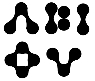
Custom type designs
In todays crit, the main feedback responses in my group were to experiment with typefaces and try out custom type. A concept that I had in light of this was to play around with censorship through legibility; a way of doing this that might work would be to create some custom typefaces just for the vowels, which could compliment and juxtapose the Futura body text. In my crit, people said it would be interesting to use the same visual language as the 52 13 symbol, which would reinforce the consistency of my design.
These are the initial vowel designs I created using the same rules as the 52 13, using the same circular glyphs joined together. I like how these turned out as they have a good balance between being legible and abstract, as well as keeping the visual language of the project consistent and fitting to the techno tone of voice.
I decided to test out how the vowel designs worked by putting them alongside the Futura typeface; I really liked how these turned out as they juxtaposed the hard edges of Futura, as well as linking to the themes of censorship within the project through making the title text slightly illegible. I now want to put these into further context by putting them in the posters.


No comments:
Post a Comment