Visual references for the CD cover
Before I begin to work on the CD cover designs, I wanted to look at some examples for visual research to reference elements of my design. I want the cover to remain minimal and continue to feature the motifs I have created for the publication; meaning the symbols and colour scheme.
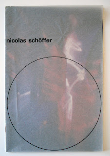
Wim Crouwel for Nicolas Schoffer
I really like the idea of possibly layering elements such as this example above to censor or hide components of the CD cover design; this could possibly involve having the plastic of the cover frosted or tinted, or maybe I could create some stickers to disrupt the design? Despite this, I don't want the visual language to be over complicated or overwhelming, so using a more minimal approach would be more fitting in regards to the tone of voice I want to create/ the user experience.
Ali Rigby
I really like this CD cover design by Ali Rigby as it has the kind of tone of voice I want to create; it is very reminiscent of techno culture and the early 2000's visual language associated with this. I also like the idea of having the CD exposed with clear plastic, but the only thing is that this distracts from the notion of censorship I want to communicate. Due to this, I was thinking of having the CD cover design completely blocking out the publication, with other elements such as stickers hiding certain areas. Despite this, I need the CD cover design to still be clear to the audience, as it still remains as an educational tool; I want to find a balance between it being allusive/ intriguing but also clear what the publication is about. I feel like I can achieve this by creating a cover similar to this example that is visually inspired by techno culture, as the audience of techno tourists will be more inclined to pick it up.
Justin Hunt Sloane
This vinyl artwork by Justin Hunt Sloane is pretty interesting as it plays with blocking out elements of the vinyl; I could possibly have elements of the CD cover exposing and revealing sections of the publication to hint to the audience the contents of the publication without being too explicit? It might be interesting to have some of the symbol shapes cut out of the cover, to keep more of an abstract sense of voice.
I really like this album artwork design as it plays with juxtaposing elements and conflicts with visual hierarchy; for example, the type is somewhat eligible as the cover is transparent. I also really like the idea of having stickers overlaying elements, as it provides a nicer tactile and multilayered feel to a physical object. This links to how I want the purpose of my publication to be something that is kept as a nice physical product, so I need to carefully consider how the exterior looks in terms of its audience and visuals.


No comments:
Post a Comment