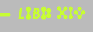
Testing out the custom typeface
I decided to further test out the custom vowel typeface by putting it into the context of the text on the poster designs; in both German and English.
I think that overall they work pretty well, but could do with some improvement in terms of kerning possibly to make sure they are all consistent. My only worry however is that because the type on the posters is relatively small, having the custom type might hinder its legibility maybe a bit too much? I definitely want to get some peer feedback on this, as I am unsure whether to just stick to using the custom type for titles and not body text like this.


No comments:
Post a Comment