Experimenting with layout and the architecture of the book
I want to explore different alternative avenues that I could go down in terms of how my book involves the subject matter of stickers; to properly convey the functionality of stickers within politics, the book could use its layout to build a broader interactive element with the user, as well as referencing themes within politics - such as censorship.
This example uses stickers to explore themes of censorship within politics, by covering areas of the book and challenging the covers' legibility. In this case, the stickers can be peeled away to reveal the content underneath, which further expands on the act of rebellion and revealing the truth (akin to extinction rebellions' values). I definitely think this idea of hiding elements of the layout with stickers is a strong concept, and I could also push it further and create a way more chaotic outcome.
This version of a layout concept for the book also uses the idea of censorship through using the same shapes as the last design, but pushes the visual language further through separating the layers of the book into individual tip-ins. I feel like this works in the sense that it communicates the idea of rebellion; the design is chaotic and rebels against the traditional formalities of a book layout. As well as this, it develops more of a fun user experience as the reader is empowered to break apart the book in the same way that activism breaks down conventions and 'the man'. In order to continue the use of stickers, the shapes involved in this version could be stickers themselves; holding the tip-ins together to be then peeled away to separate the elements of the design. This concept however, definitely needs working on visually, in terms of the relationship between the text and tip-ins.
This mockup displays the separate layers of the concept better; each layer getting smaller and smaller like a Russian doll. To further align with the visual approach of censorship and hiding things within things, the book could also have a box that contains the stickers for the publication; this would work in empowering the user experience, as they can explore the book in a more intriguing and fun manner.
This version uses a block colour palette to help me experiment with different textures and inspire what paper stocks I could use; I like how this colour palette is somewhat reminiscent of childhood, which evokes a playful tone. Despite this, I feel like it looks and seems a bit too flat for my liking, as I want the book to really rebel against conventions with a clash of textures and colour.
This outcome experiments more with the format and paper size of the book; using a bumper stickers dimension in order to pay homage to the origins of stickers within politics. I feel like this format is a fun way of breaking against paper size conventions, which really aligns with the tone I want to represent in the book. The idea of this concept is that each page can be peeled off as a bumper sticker, thus further expanding on the interactivity of the book; the only issue here is that I also need to consider how I want to involve content into my publication - I could always use two formats and bind them together? Or I could even play around with applying the same bumper sticker format to the content.
This example explores how I could use the bumper sticker format in a way that could involve content; each bumper sticker would be a separate tip-in, allowing the user to flick through them individually. This could also be broken up with other sized sheets that provide context, or the context could be printed on the back of the bumper stickers? For this idea I definitely need to make some physical mockups.
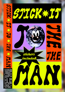
This concept plays around more with how the text and image could be broken up into individual stickers; the cover follows a grid structure that divides the text into their own stickers, thus enabling the book to be more interactive and relating to the theme of stickers. I feel like this format allows the book to have more of a fun colour palette, as it has a bit of a mish mash of colours and shapes. This also relates further to the collective undertones of stickers, which celebrates the collective nature in the medium.
This mockup showcases how the book could be separated into stickers; this rule and grid could be applied to the whole publication? Also, the book could be wrapped in a poster that the audience could stick their stickers on -I need to consider how the user can become an activist with these stickers.


No comments:
Post a Comment