Illustrations
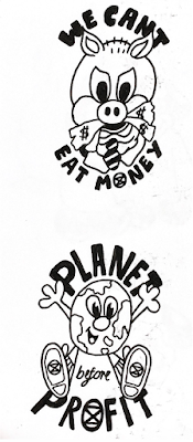
I wanted to explore different styles of illustration for the sticker concepts, through using hand drawn type and anthropomorphising objects/ fruit and veg. I feel like this is very much inspired by contemporary cartoon design at the moment, as well as taking inspiration from classic atypical fruit sticker designs. I definitely want to ensure that my publication has a strong contemporary feel to it, as the audience will be 18-25 year olds (vastly consisting of students). The illustrations are inspired by the OOA's smiling sun logo 'atomic power? No thanks!', which embody the fun and non violent attitude to politics I want to convey. I quite like the use of hand drawn type, as it provides more of a fun and playful atmosphere, which aligns with the tone of the publication.
Using visuals from the Moomins, I feel like I could play with familiar characters within my publication to further expand on a lighthearted atmosphere; the Moomins in particular are associated with very wholesome and innocent narratives, so are perfect for the concept of non violent protest/ imagery. This offers a nice contrast between innocent imagery and political messages, which is the poignant theme of the publication. The only issue with using Moomins contextually would be the copyright issue of it, and also I kind of want to generate my own imagery and characters for the stickers.
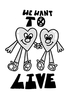
In order to experiment with creating my own characters for the stickers, I drew some initial sticker concepts inspired by slogans used by Extinction Rebellion. I wanted to still focus on wholesome imagery contrasted with political messages, in order to develop and continue a playful tone. I think these stickers are really successful in getting a message across, as they aren't too explicit and have a fun sense of voice; I think generating characters allows the stickers to feel more interactive, as well as aligning with Extinction Rebellions' views.
I also wanted to integrate the Extinction Rebellions' logo into my character illustrations, as they would resinate more with the political movement; due to this, I developed a hourglass character, that represents the idea that society is running out of time.
Digital developments
I developed some more digital designs that featured Extinction Rebellions' colour scheme; I quite like how these turned out, as I definitely want to use a colourful colour palette for the publication. This also could be done on a neon vinyl or something? I need to consider experimenting with different mediums and colours to build a colour palette for the final outcome.
These illustrations also could be cut out into some interesting shapes for the sticker sheets; I could take inspiration from existing sticker books, or even a similar format to tattoo flash pages?


No comments:
Post a Comment