Layout/ colour tests
In order to get a better grip at what kind of visual language I want to explore in the book, I decided to play around with colour schemes, type and illustration styles.
The illustrations for the bumper stickers are focused around creating a fun sense of voice, with intentionally clashing colours to vocalise the concept of clashing against the establishment within activism. I think I want the whole book to use this colour palette as I feel like it aligns with the tone I want to create; the colours and illustrations both share a fun and playful sense of voice, which is crucial as I want the bumper stickers to be a dominant factor in the visual hierarchy of the book - they are also pretty important as the user can peel them out of the book and use as visual activism.
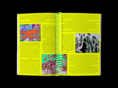
I also experimented with type setting and how I can play with double page spreads within the book; this version uses the same colour palette as the stickers and colours in order to build consistency and a strong visual language - I feel like the green works really well in being very vibrant which is a key part of conveying visual activism through bold imagery. I want the type to be super crammed in order to break against typical conventions of type setting; challenging the idea of legibility in order to communicate the undertones of rebellion in activism. As well as this, I think it'd be cool to have the images and sections of the type cut out to be peeled off as stickers.
I thought it'd be interesting to have the front cover in more of a gridded structure, as I could build more of a playful colour palette which kind of pays homage to comic book layouts - this fits with the illustration style of the bumper stickers, as well as using the same format. It would be quite visually interesting if this cover was split up into 4 separate bumper stickers, as it would compliment the contents of the book a lot more, due to using the same colour scheme. The type in this version also challenges legibility in a sense, as it uses a different typeface for every letter; I also like how it features some cartoons which intertextually references the contents of the bumper stickers.
This typeface uses more of a warped effect in order to play with legibility; the only issue is that I feel like it doesn't fit the style of the illustrations/ bumper stickers, which could hinder the consistency of the book.
This version of the bumper stickers uses block colour backgrounds to frame the illustrations better, as well as building a stronger colour palette in order to develop a consistent visual language within the book. I like how this experiment turned out, as having the bumper stickers super vibrant means that they work well together and separately also; this is crucial as obviously they'll be cut out individually to be peeled out.
Mockups
I produced a few mockups to help me visualise the landscape of the book and how the pages will look physically. I think a key part of this development process that I need to work on is actually doing physical mockups by printing out pages; this will help me expand on my ideas more and figure out how the architecture of the book will work out. As well as this, I now need to consider how the posterzine will fit into this visual language, and the actual content of this element of the book.


No comments:
Post a Comment