Board game concept developments
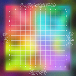
In order to develop the political compass board game concept further, I wanted to focus on introducing a grid and improving the typefaces featured on the board itself. I began by creating a grid that would make the user experience clearer, thus improving the interactive elements of the game; this was crucial as although the game is meant to be intentionally absurd, the user has to have some concept of what they actually do to play the game.
These developments are focused on using the warped papyrus sans typeface, as I wanted the type element of the outcome to reference this memetic typeface, thus strengthening the board games relevance in communicating elements of meme culture. I also like how this typeface challenges legibility; overlapping glyphs and curved edges contribute to more of an illegible visual language, thus linking back to the notion of absurdism theory discussed in my essay; everything in the games' visual language needs to be somewhat confusing. The main issue with the visuals in the iteration above, however, is that it looks a bit flat due to the blurred effect making the colours blend into one. Although this gradient/ blur effect links to the approach of intentionally bad/ tacky graphics found within memes, it could be pushed further to have more depth.
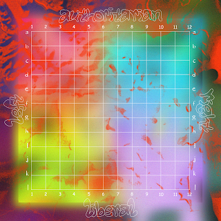
Resultantly, this outcome feels a lot more refined as I added some extra textures to kind of break up the blurred effect in order to add depth into the visual hierarchy of the board. I focused on trying to keep the added texture subtle, as due to its' red colour, I didn't want it to distract from the colours for each section on the board. I still want the blurred graphics to be the main component of the design, as it fits well with the concept of memes and social media; it is somewhat reminiscent of instagram posts loading, with blurred visuals. Due to this, I actually added a slight softened edge onto the texture, to avoid creating too much of a harsh and contrasting texture.
These images are mockups of how the board will look folded up into its' box; I really like how they look quite abstract and ambiguous, as it links to the concept behind the notion of absurdism. The next step in this design process will be to consider the back of this board:
Back/ logo design
Of course, it would be rude not to experiment with some designs involving word art type, as it links so well to the theme of meme culture; these designs play on this meme reference, by focusing on using witty and intentionally bad design. Out of the two, I definitely prefer the gradient colour version, as it references the colours within the political compass nicely.
I decided to create an alternative logo concept, that could possibly feature on the back of the board; I decided on the name 'notions of absurdism' as it references the theoretical concept behind the practical outcome, as well as linking to the topics discussed within my essay. In order to maintain a witty visual language, the logo uses comic sans and some star bursts that relate to meme graphics; the illustrative element also further adds a fun sense of voice, thus refining the games' visuals to be more playful.
This logo design was definitely a failed attempt; I tried referencing the meme icon clippy from microsoft word, but I feel like the previous illustrative logo design wrks better as clippy is potentially too overpowering in the logos' visual hierarchy (sorry clippy). Also I think I went a bit overboard with the 3D rendered effect.


No comments:
Post a Comment