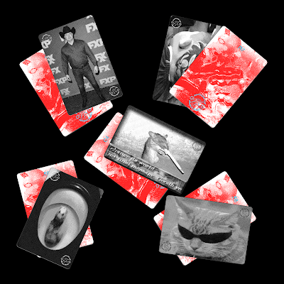
Card designs - front
This part of the design process was fairly easy, as it just consisted of having to find random memes and 'shitposts' that don't correlate to politics at all in order to relate to the notion of absurdism. The initial process involved finding random images for the front of the card, then creating some form of red reveal for the flipside of each card. Because I will not be creating the board game physically, I only really need to create several cards to show the principle of the game. In context of the game however, in theory there would be over 200 meme cards to make the game last longer; ideally I do need to research how many cards are in your average board game, such as trivial pursuit, in order to contextualise the game more.
Card designs - Back
Because the aim of the game is to place the meme cards where you think they belong on the compass, there needed to be some kind of system within the game that can reveal the actual answer. Due to this, I looked into creating a red reveal design on the flipside of each meme card, which reveals the correct answer. The red texture I used within these designs is taken from the board itself, in order to create a consistent visual language. In order to make the game work, the type needed to be cyan to work in the red reveal. I wanted to feature the logo onto the design in order to create a brand image for the game, as well as using papyrus sans and comic sans for the type.
Using a sheet of red acetate, the user can reveal the correct answer (as shown above). My main worry is that I don't think I've actually done it right- it needs tweaking as the text isn't very clear.
Functionality
This is just a quick mockup showcasing the visual language of the meme cards; I feel like I could experiment more with effects applied to the meme images themselves in order to make the design more contemporary.
Issues
I spoke to some peers and it turns out that I didn't do the red reveal right, so to improve the functionality of the design, I tweaked the design and also made the text smaller so it isn't overly obvious to the user. Also, I feel like keeping the images for the meme cards in their raw form is a bit lazy, so I want to edit this element further.
Improvements
In order to make the meme cards more interesting, I applied a black and white halftone effect to the visuals which definitely created more of a contemporary feel. Also, this creates a nicer contrast to the political compass board, as the meme cards will have no colour in contrast the the overly vibrant visuals of the board.


No comments:
Post a Comment