Playing with horror visuals
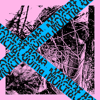
After looking into visuals in Russian Horror and Tarkovskys' shots, I decided to manipulate them and test out some visuals for the album cover. Shown below is a shot from 'Mirror' that was printed out and crumples/ ripped slightly to be rescanned to add texture. I used this method for several images, as it provided a nice textured visual, as well as contributing to an eerie atmosphere. I also though that the image below was quite fitting, as visually linked to the idea of Molchat Domas' translation meaning 'houses are silent'.
I played around with using thresholds for the imagery, and super cropping/ duplicating element; this helped me experiment more with composition and adding a dramatic atmosphere. I wanted to reflect the juxtaposition of harsh and soft within post punk with pretty dramatic textures/ imagery and a soft pastel colour palette. This helped the design stray away from being stereotypical for the genre.
Feedback
- Explore ‘houses are silent’ more; use plastic cover to relate to this, e.g. use ‘no entry’ tape
- Buerak; ‘good times’ translation
- Focus on the juxtaposition of happy and sad; move away from the typical designs of post punk
- Use plastic cover to put different colours on
The main issue highlighted in my feedback was that my designs were too close to existing Russian post punk covers, and looked too melancholic and dull; due to this, I was suggested to play with adding ironic elements with really bright colours and overlaying vivid imagery. The first design above links to the idea of 'houses are silent', with the text reflecting similarities of a 'no entry' tape; this adds an eerie atmosphere, but is juxtaposed with the colour palette. These overlays could be more immersive through being printed onto the plastic cover, which would introduce a multilayered element to the design - akin to the layers of tones within the genre.
In regards to the plastic overlay, it was suggested that I could create imagery linking to the meaning of the band name. These are :
Molchat Doma - 'houses are silent'
Buerak - 'Good times'
Here there is a clear juxtaposition between happy and sad, which links further to the imagery I have produced so far. I think now I need to focus on playing more with type and just continuing to focus on straying away from the stereotypes of the genre; I still want to use melancholy imagery however, in order to provide consistency to the other band covers - I don't want them to loose that identity.


No comments:
Post a Comment